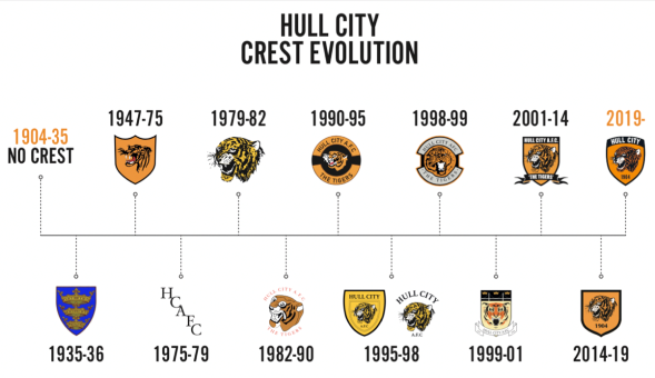
Hull City has revealed the new design for its club crest, the product of a supporter-led process and shows evolution rather than revolution with a slight change in shape.
The tiger’s head that was first used in the 1970s, and has been a constant on the club’s crest since 2001, is retained as is the club’s year of formation, 1904. The biggest change comes with the reintroduction of the wording ‘Hull City’ which sits above the head.

The new crest, which will be in place for the start of the 2019/20 season, is the result of an extensive process which concluded with a Creative Panel that brought together the wishes of the wider fan base, and those involved are pleased with the outcome.
“Following feedback from supporters, it was important to the club to ensure this update was supporter led,” said, Vicky Beercock, Head of Marketing and Communications for Hull City.
“The numerous stages in the process ensured we heard the masses and were also able to have productive sessions with a smaller group who the supporter base had entrusted with representing their views.
“The panellists have been incredibly engaged, passionate and collaborative at every step of the way. We can’t thank them enough for the time they have committed to the process to ensure our next crest is a crest our supporters and players are proud to stand behind in the coming seasons, whilst also being a great next step in our journey as a club.”
Paul Matson, a lifelong Hull City supporter & Chairman and Founder of Hull 4 Heroes, said: “We all understood that the tiger was important and that the name ‘Hull City’ needed to be back on the crest along with ‘1904’. We’ve been able to include all of that.”
Cathy Phillips, Chief Marketing Officer for KCOM, the club’s stadium sponsor, added: “It was really exciting to have the opportunity to be involved in a process of developing a new brand, particularly when you’re balancing the heritage of Hull City with a modern feel.”